Extra-Illustrated: Literary Scrapbooking

Published texts have been embellished by their owners in many different ways: for example, beautiful leather and gilt bindings or fore-edge paintings. New in Special Collections, Facing the Text: Extra-Illustration, Print Culture, and Society in Britain 1769-1840 by Lucy Peltz discusses another method of embellishment, known as extra-illustration.


extra3.jpg
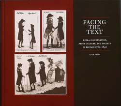
Peltz, Lucy. Facing the Text: Extra-Illustration, Print Culture, and Society in Britain 1769-1840. San Marino, California: Huntington Library, Art Collections, and Botanical Gardens, [2017]. Z1023 P45 2017

From Folgerpedia: “Extra-illustrated books are published texts that have been made into a unique copy by a former owner through the permanent addition of prints, autographs, letters, etc. Typically, the additions are mounted on additional leaves, and the book is rebound to accommodate its increased thickness.”


Popular in the late 18th and 19th centuries, extra-illustration is sometimes known as grangerizing, named for James Granger who published Biographical History of England in 1769, which identified and encouraged the collection of portrait prints. Many who owned that work inserted their printed portraits into the text. Shakespeare and the Bible were popular texts for extra-illustration, as were books describing travel. Not infrequently an extra-illustrated text, disbound and rebound to accommodate both text and illustrations, grew well beyond its original size.

extra4.jpg

Facing the Text begins with a description of the 45-volume extra-illustrated Bible known as the Bowyer Bible, in Bolton Central Library, UK. The Huntington Library owns a 60-volume extra-illustrated Bible known as the Kitto Bible. The Folger’s 21-volume extra-illustrated Dyce-Hoe Shakespeare was originally a six-volume set. In Facing the Text Peltz discusses the characters and the culture that popularized extra-illustration and the significance of the practice in the history of the book.


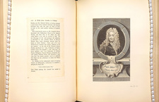
Among the examples of extra-illustrated books in Special Collections are three from the Philbrick Collection.

walk5.jpg
walk6.jpg
walk7.jpg
walk8.jpg

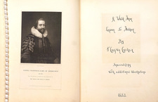
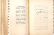
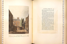
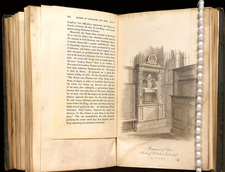
A Walk from London to Fulham (images above), by Crofton Crocker, published in 1882, was originally a small pocket book. The extra-illustrated copy (DA683 .C76 1882) has been disbound and its pages and extra-illustrations beautifully mounted on larger pages rebound into a handsome, hefty volume.
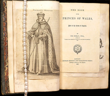
princes3.jpg
princes4.jpg

The Book of the Princes of Waleshttps://ccl.on.worldcat.org/oclc/5385583 (images above), vols. 1-2, by Dr. Doran, published in 1860, was also a small book. The extra-illustrated copy (DA28.3 .D67 1860) was disbound, and several pages together were inserted throughout a larger volume of mounted illustrations.

Terry3.jpg
Terry4.jpg

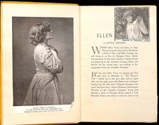
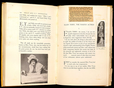
Special Collections’ extra-illustrated copy of Ellen Terry and Her Secret Self (PN2598.T47 C73), by Edward Gordon Craig, copyright 1931, has not been disbound. Instead portraits, notes, articles, and a variety of other extras have been added throughout the text.

New in Special Collections – The Noblest Roman

Roman1.jpg

In Shakespeare’s Julius Caesar, Mark Anthony names Brutus the “noblest Roman of them all.” New in Special Collections, The Noblest Roman: A History of the Centaur Types of Bruce Rogers (Z232 R67 K45 2016) offers another candidate for that title. Created in the early 20th century by Bruce Rogers, a celebrated American typographer who favored classical design, the Centaur typeface harkens back to type used in the incunabula period of printing. The name comes from the title of the first book printed using the type: The Centaur, by Maurice de Guerin, in 1915.


Here is high praise for the typeface from the Introduction, p. 11: “It will depend upon the skill and talent of the typographer to deliver the words to the reader, much like a musician interprets music for the listener…. The greatest achievement in typography, then, is to create the best-tuned instrument, capable of playing a tune at “perfect pitch.” The challenge is to do so with elegance, grace, and style, much like a musician. The Centaur type of Bruce Rogers is such an instrument: it possesses a degree of dignity and grace that is as sublime as it is impossible to replicate.”


Roman3.jpg:Roman2.jpg

Besides the examples of Centaur typeface you will see in this slim volume, Special Collections holds many examples of books using the Centaur font and of titles printed by Bruce Rogers.

Kelly, Jerry and Misha Beletsky. The Noblest Roman: A History of the Centaur Types of Bruce Rogers. San Francisco: The Book Club of California, MMXVI [2016].

Volvelles – Movable Circles in Books

Volvelles are one of the oldest forms of movable parts in books. According to the Oxford English Dictionary, volvelle is from medieval Latin volvella or volvellum, most likely from the Latin verb volvĕre, “to turn.” The OED defines volvelle as “an old device consisting of one or more movable circles surrounded by other graduated or figured circles, serving to ascertain the rising and setting of the sun and moon, the state of the tides, etc.”

In Early Modern times, volvelles were used especially to illustrate principles of navigation and astronomy. These “movable circles” were generally constructed of paper and attached to the book page using thread or, sometimes, glue. “Because of the precision required to record accurately certain types of data–charting a lunar eclipse, measuring nautical distance or calculating a mathematical equation, for instance–such disciplines were believed to be well served by the volvelle’s capacity for both rigorous alignment and reliable precision.” (Helfand, Jessica. 2002. Reinventing the Wheel. New York: Princeton Architectural Press, pp.18-19.)

The Claremont Colleges Library Special Collections has several examples of volvelles in Early Modern texts and at least one 2014 publication. Here are images of volvelles from some of those texts.

Calendarium2.jpg

Calendarium
Joannes Regiomontanus
[Venice]: Bernhard Maler (Pictor), Erhard Ratdolt, and Peter Löslein, 1476

cortescombo.jpg

Breue compendio de la sphera . . .
Martin Cortes
[Seuilla], [1551]

Apian-combo.jpg

La Cosmographia de Pedro Apiano
Peter Apian
En Anvers, por Iuan Bellero al Aguila de Oro, 1575

Apian’s volvelles are quite complex, each having several different movable parts.

Uruna-combo.jpg

Delineacion de lo tocante al conocimiento del punto de longitud del globo de tierra, y agua, y de la causa de las crecientes, y menguantes del mar
Juan González de Urueña
En Madrid: Por Diego Miguel de Peralta, impressor y mercador de libros …, año 1740

Diderot-combo1-2.jpg
Diderot-combo2-2.jpg

Diderot Decaptioned
Charles Hobson
[San Francisco, California]: [Pacific Editions], [2014]

In Diderot Decaptioned, notice that, different from the Early Modern volvelles, these volvelles are under the page and turn to reveal different captions for each image.


New Exhibition

DARK MATERIALS: KNOWLEDGE IN THE SEVENTEENTH CENTURY
Honnold/Mudd Library, 2nd floor near north entrance
Dec 1, 2010-Feb 25, 2011
John Milton (1608-1674) was not only among the most influential of British poets. He was the most directly involved of any British poet in the centers of political power and in the great historical events of the 17th century in Britain. He was also arguably the most learned of the great British poets, even in a learned and bookish century.
PARADISE LOST.jpg
This exhibition, drawn from the collections of Special Collections, Honnold Library, and Denison Library of Scripps College, focuses on our holdings of Milton’s most famous work, his epic, Paradise Lost, first issued in 1667, and on books and pamphlets written by his contemporaries who were espousing ideas of religion, nature, science, politics, and philosophy during this turbulent century.
The exhibit was mounted to coincide with the Milton Marathon of 2010. Many thanks to professors Jacque Wernimont of Scripps College and Colleen Rosenfeld of Pomona College who hatched a fantastic plan to read Paradise Lost all day.

Milton Marathon!

Dec 1, 2010 at 7 p.m.: “How Milton Sounds” talk by Jeff Dolven of Princeton University
Dec 2, 2010 at 8 a.m. – 8 p.m. Milton Marathon, Mudd Quad outside the north entrance of Honnold Library. Come by and read and/or listen to friends and colleagues read Paradise Lost. There’ll be refreshments!

Recent Gift: Audubon prints

Special Collections recently received a gift of 31 19th century prints. Among the items in the gift are thirteen original John James Audubon hand-colored lithographs (20 1/2 in. x 26 1/2 in.) from the quadruped series, including the American Badger (pictured below) and Common Flying Squirrel.
Audubon American_Badger
Eleven prints are chromolithographs (16 1/2 in. x 21 1/2 in.) from the Bien edition of Audubon’s Birds of America (ca. 1858-1862), including Puffin:
audubon puffin print
These prints are amazing examples of early and mid 19th century printing. When the Bien edition of Audubon’s Birds was being produced, chromolithography was new, and Julius Bien of New York was a pioneer in this technique of color printing.

Protestant Hymnal Printed in India

Believed to be the first Protestant hymnal printed in India is Amos Sutton’s Hymns Especially Designed for Divine Worship Public, Social, and Private, Selected from Various Authors (Cuttack, Calcutta, Orissa Mission Press, 1840). A copy of this scarce hymnal can be found in the Robert Guy McCutchan Collection in Special Collections, Honnold Library. Call number BV 510.O7 S88 1840
hymnal india001
Title Page of Sutton’s Hymns
This small note about its printing is found at the end of the Preface:
hymnal india002
The Orissa Province had been under the control of Britain since the late 18th century. In the 19th century, control was transferred from the East India Company to the Crown. The Orissa Mission was the site of significant development when business and political enterprise brought with it the establishment of schools and missions, and by the 1860s, it was a center for printing and publishing of newspapers and journals.
Amos Sutton arrived in India around 1825 and established himself at Cattuck in the Orissa Province where he translated hymns into the Oriya language, among other activities. His hymnal from 1840 is printed in English and comprises texts edited by Sutton from various sources; in his Preface, Sutton admits he edited some source texts dramatically.
For many years Dean of the School of Music at DePauw University, McCutchan was editor of the 1935 edition of the Methodist hymnal. The McCutchan Collection is particularly rich in Methodist hymnals and psalters including early editions by John Wesley, but it also contains hymns that have been sung in America by all denominations.
The collection dates from the early 17th century to the present, and the majority are American publications. The range is broader than hymnology: song books of temperance societies, Grange and fraternal organizations, and political parties; Civil War songs; and children’s song books are to be found among the titles.

Designed by Merle Armitage–Exhibition on view through Feb 1, 2010

On view through February 1 at Honnold/Mudd Library are books from the special collections at Honnold and Denison libraries designed by avant-garde book designer Merle Armitage (1893–1975), one of California’s leading advocates of modern culture.
armitage poster image-2
Armitage designed more than forty books for which he wrote essays and/or edited; he designed more than sixty books for other authors and had a long affiliation with New York publishers Weyhe and Duell, Sloan, and Pearce. When he “retired”, Armitage moved to Yucca Valley, California, where he continued to write, design, and publish books under the imprint Manzanita Press until his death in 1975.
gershwinsprd
Armitage knew and authored books about some of the finest artists of the century, among them Igor Stravinsky, Martha Graham, George Gershwin, Pablo Picasso, and Rockwell Kent, to name a few. A participant in the circle of artists and writers surrounding local rare-book dealer Jake Zeitlin, Armitage supported the work of his friends such as Edward Weston and Ramiel Mcgehee. Armitage authored and designed the first published monograph about Edward Weston. Scholars have written of Armitage’s background in artist promotion as the beginning of his life-long interest in re-imagining– and innovating –the design of printed books for the modern age.
armitage art book 2
In Notes on Modern Printing, Armitage offers eleven ideas for designing a book; of these ideas, number six is a good summary of his aesthetic: “Understand the text…know your primary aims…let form follow function.”

Crispin 21, A 15th Century Book of Hours from the Netherlands

Among the Libraries most frequently used collections by faculty and students is our superb collection of medieval and renaissance manuscripts, excellent sources for teaching medieval life and thought. Notable in our collection are several beautiful books of hours, compilations of prayers and texts intended for lay people, especially women, to follow and worship during the liturgical season.
Crispin 21 was copied after 1471, as Pope Sixtus IV is mentioned in an indulgence. This manuscript is composed of parchment leaves of beautifully calligraphed text, ornately decorated initials and pen work. The text includes a calendar of feasts, Hours of the Virgin, Long Hours and Short Hours of the Cross, Psalms, prayers, and the Office of the Dead. In the image below you can see that the binding is 15th century; the central image blind-stamped on both front and back is the Virgin and Child. The clasps are original as well. In the late 19th century the manuscript’s spine was rebacked in morocco by Zaehnsdorf, one of Europe’s notable fine custom binders, which you can see along the spine of the volume.
crispin 21001-1
Pictured here are leaves 10-11, the beginning of the Hours of the Virgin:
crispin 21002
The Crispin Collection of exquisite examples of early bookmaking and fine binding was given to Honnold Library by Dr. Egerton Crispin during the 1950s and early 1960s. Nearly fifty Medieval and Renaissance manuscripts, including 12th century sermons, 13th century Bibles, 14th and 15th century books of hours, missals, psalters and antiphonals are among the contents of the Crispin Collection.
Denison Library on the Scripps College campus, and the library at the Claremont School of Theology also hold significant collections of medieval and renaissance manuscripts. These collections are cataloged definitively in Dutschke and Rouse, Medieval and Renaissance Manuscripts in the Claremont Libraries (University of California Press, 1986), call number Z 6621 .H5814 1986

Manicules, or, those pointing hands in manuscripts

Our Bodman Collection copy of Filipo Beroaldo’s Orationes: Prelectio[n]es, Praefationes: & Quaedam Mythic[ae] Historae Philippi Beroaldi (Parrhisiis, in aedibus Ascensianis: & Joannis Parui [1515]), call number HON SPCL BODMAN PA 8475 .B6 1515, is full of whimsical manicules and cartoons drawn in the margins by at least one 16th century reader. For students of Renaissance books, these marginal notations are charming; each one is drawn with a unique sleeve style. Was this reader a student of fashion as well?
Two sample pages:
manicule002
manicule001-1
closer view:
manicule001