楊柳青年畫 ( New Year Woodblock Prints of Yangliuqing)

The Asian Library at The Claremont Colleges Library holds two sets of original and rare 楊柳青年畫 (New Year Woodblock Prints of Yangliuqing). The two sets, each consisting of 12 new year paintings printed with woodblock and manually colored, were produced by 天津榮寶齋 (Rongbao Studio in Tianjin) in the early 1960s. A search in WorldCat (union catalog for libraries in the United States and other countries) indicates that the two sets held in the Asian Library are not available at any other libraries in the United States.

The new year woodblock prints from Yangliuqing are well-known Chinese folk paintings. They originated from Yangliuqing, a town in Tianjin City of China during the reign of Emperor Chongzhen (崇禎) in the late Ming dynasty (1368-1644 AD) . Linked to Chinese folk customs and daily life, the prints are popular ornaments used to adorn doors and rooms during the Spring Festival (春節) in China, expressing good wishes for the new year. They cover a wide range of themes, all aiming to convey messages of good luck, a festive atmosphere, and praise of traditional Chinese virtues and worship of gods, especially those of fortune, prosperity, and longevity.
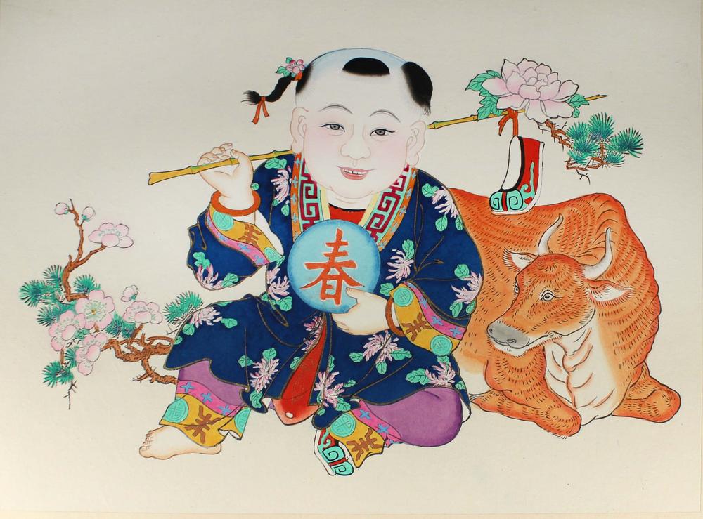
新春大喜 Xin Chun Da Xi
(Happy Spring)
The painting portrays the coming of the Spring and the best wishes for abundant harvests throughout the year, with good weather and strong cattle. The character the boy holds is 春 (pronounced “chun”, meaning Spring).

Babies are a popular theme in the paintings because for centuries Chinese people believed that more children would bring more blessings and greater happiness. A recurring image is the cherubic baby holding a lotus flower while clutching a big fish. In Chinese, the word “lotus” sounds similar to “consecutive, repeatedly, or one after another”,  and fish is a homophone of “surplus” so together they imply a wish for “prosperity year after year (連年有餘).”

連年有 餘 Lian Nian You Yu
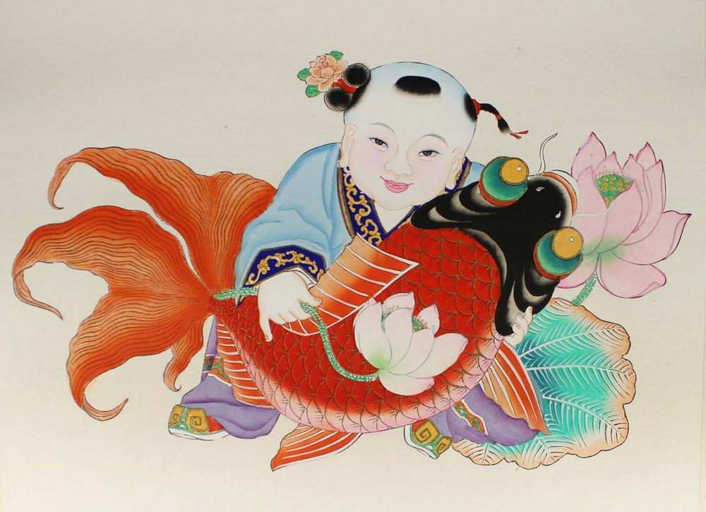
(Having surplus year after year)

Other homophones and symbolic objects include Bat 蝠, pronounced as “fu”, homophone of 福 fu, meaning Fortune; Fan 扇, pronounced as “shan”, homophone of 善 shan, meaning Kindness; Orange 桔, pronounced as “ju”, homophone of 吉ji, meaning Luck; Chime磬, pronounced as “qing”, homophone of 慶qing, meaning Celebration.

福善吉慶 Fu Shan Ji Qing
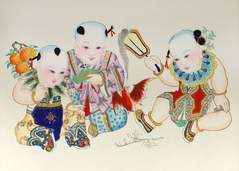
(Fortune, kindness, luck, and celebration)

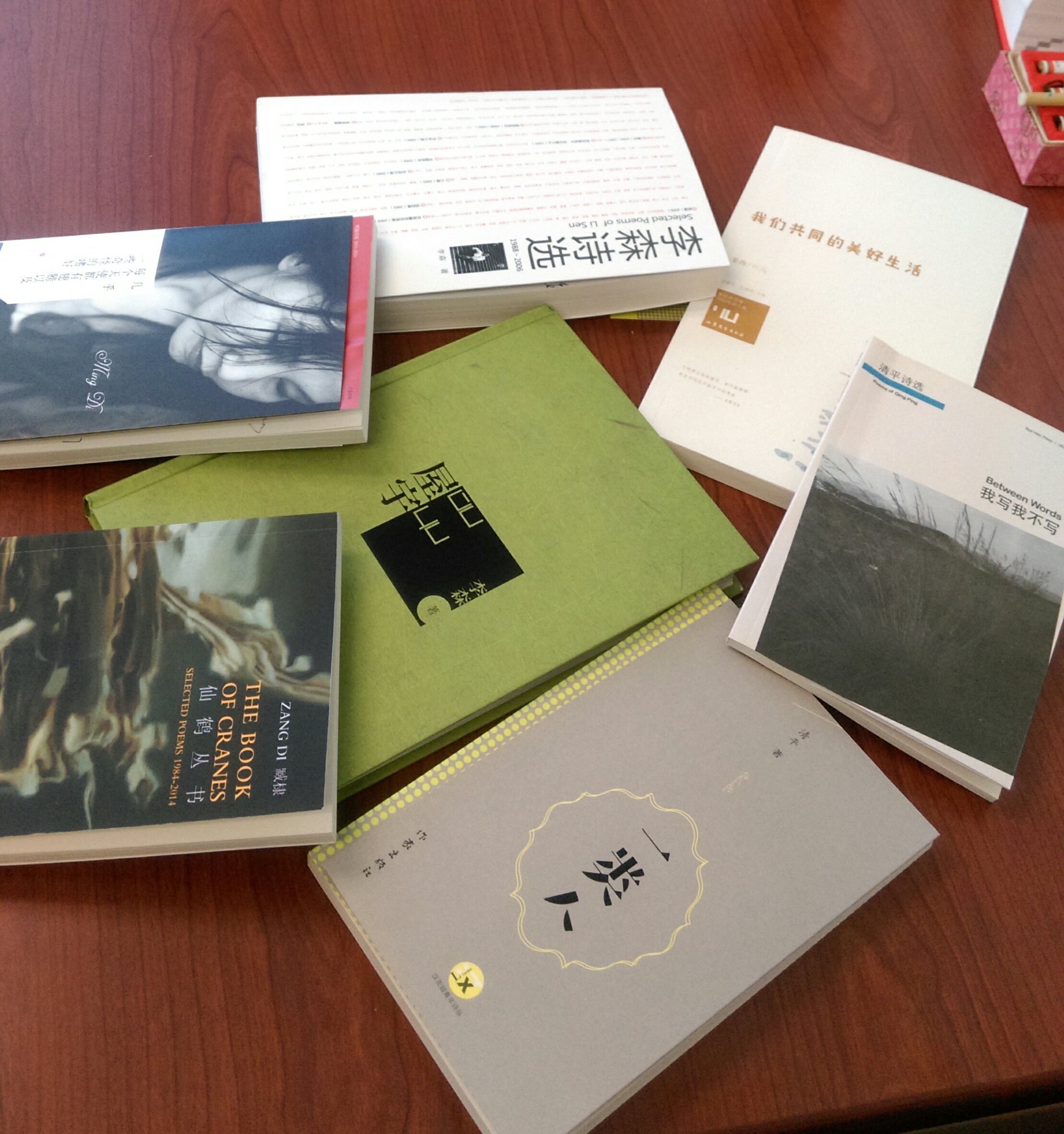
Follow this link to view all paintings in set #1, 天津荣宝斋印制《杨柳青年画选》第1辑.

Follow this link to view all paintings in set #2, 天津荣宝斋印制《杨柳青年画选》第2辑.

Extra-Illustrated: Literary Scrapbooking

Published texts have been embellished by their owners in many different ways: for example, beautiful leather and gilt bindings or fore-edge paintings. New in Special Collections, Facing the Text: Extra-Illustration, Print Culture, and Society in Britain 1769-1840 by Lucy Peltz discusses another method of embellishment, known as extra-illustration.


extra3.jpg
Peltz, Lucy. Facing the Text: Extra-Illustration, Print Culture, and Society in Britain 1769-1840. San Marino, California: Huntington Library, Art Collections, and Botanical Gardens, [2017]. Z1023 P45 2017

From Folgerpedia: “Extra-illustrated books are published texts that have been made into a unique copy by a former owner through the permanent addition of prints, autographs, letters, etc. Typically, the additions are mounted on additional leaves, and the book is rebound to accommodate its increased thickness.”


Popular in the late 18th and 19th centuries, extra-illustration is sometimes known as grangerizing, named for James Granger who published Biographical History of England in 1769, which identified and encouraged the collection of portrait prints. Many who owned that work inserted their printed portraits into the text. Shakespeare and the Bible were popular texts for extra-illustration, as were books describing travel. Not infrequently an extra-illustrated text, disbound and rebound to accommodate both text and illustrations, grew well beyond its original size.

extra4.jpg

Facing the Text begins with a description of the 45-volume extra-illustrated Bible known as the Bowyer Bible, in Bolton Central Library, UK. The Huntington Library owns a 60-volume extra-illustrated Bible known as the Kitto Bible. The Folger’s 21-volume extra-illustrated Dyce-Hoe Shakespeare was originally a six-volume set. In Facing the Text Peltz discusses the characters and the culture that popularized extra-illustration and the significance of the practice in the history of the book.


Among the examples of extra-illustrated books in Special Collections are three from the Philbrick Collection.

walk5.jpg
walk6.jpg
walk7.jpg
walk8.jpg

A Walk from London to Fulham (images above), by Crofton Crocker, published in 1882, was originally a small pocket book. The extra-illustrated copy (DA683 .C76 1882) has been disbound and its pages and extra-illustrations beautifully mounted on larger pages rebound into a handsome, hefty volume.

princes3.jpg
princes4.jpg

The Book of the Princes of Waleshttps://ccl.on.worldcat.org/oclc/5385583 (images above), vols. 1-2, by Dr. Doran, published in 1860, was also a small book. The extra-illustrated copy (DA28.3 .D67 1860) was disbound, and several pages together were inserted throughout a larger volume of mounted illustrations.

Terry3.jpg
Terry4.jpg

Special Collections’ extra-illustrated copy of Ellen Terry and Her Secret Self (PN2598.T47 C73), by Edward Gordon Craig, copyright 1931, has not been disbound. Instead portraits, notes, articles, and a variety of other extras have been added throughout the text.

New in Special Collections – The Noblest Roman

Roman1.jpg

In Shakespeare’s Julius Caesar, Mark Anthony names Brutus the “noblest Roman of them all.” New in Special Collections, The Noblest Roman: A History of the Centaur Types of Bruce Rogers (Z232 R67 K45 2016) offers another candidate for that title. Created in the early 20th century by Bruce Rogers, a celebrated American typographer who favored classical design, the Centaur typeface harkens back to type used in the incunabula period of printing. The name comes from the title of the first book printed using the type: The Centaur, by Maurice de Guerin, in 1915.


Here is high praise for the typeface from the Introduction, p. 11: “It will depend upon the skill and talent of the typographer to deliver the words to the reader, much like a musician interprets music for the listener…. The greatest achievement in typography, then, is to create the best-tuned instrument, capable of playing a tune at “perfect pitch.” The challenge is to do so with elegance, grace, and style, much like a musician. The Centaur type of Bruce Rogers is such an instrument: it possesses a degree of dignity and grace that is as sublime as it is impossible to replicate.”


Roman3.jpg:Roman2.jpg

Besides the examples of Centaur typeface you will see in this slim volume, Special Collections holds many examples of books using the Centaur font and of titles printed by Bruce Rogers.

Kelly, Jerry and Misha Beletsky. The Noblest Roman: A History of the Centaur Types of Bruce Rogers. San Francisco: The Book Club of California, MMXVI [2016].

The Ch’en Shou-yi Papers 陳受頤檔案

The Ch’en Shou-yi Papers consists of Prof. Ch’en Shou-yi’s correspondences, photos, private library collections, work notes, manuscripts, etc. donated to the Claremont Colleges Library by his family after he passed away. This valuable archival collection is now housed in the Special Collection Room of the Asian Library at the Claremont Colleges Library.
The library is in the process of sorting and archiving the Ch’en Shou-yi Papers, and creating a Chinese-English bi-lingual finding aid to this massive and valuable archival collection.Currently, the correspondences and photos in the Ch’en Shou-yi Papers have been sorted and digitized through the joint effort and collaboration between the Claremont Colleges Library, the Academia Sinica Center for Digital Cultures, and the Institute of Taiwan History of Academia Sinica (ITH). This digital collection of the Ch’en Shou-yi Papers highlights his connections and correspondence with key figures of modern Chinese intellectual history, such as Hu Shih (胡适),Fu Sinian ( 傅斯年),Lin Yutang (林語堂),Chiang Monlin( 蔣夢麟),as well as a few precious first-hand documents including papers, photographs, and manuscripts. Materials in this collection are dated approximately between 1930s and 1970s.
Photo of honorary doctoral degree certificate conferred to Hu Shih by the California College in China, 1942:
Hu_Shi_diploma_1.png
For more information on the contents and scope of the digitized photos and correspondence in the Ch’en Shou-yi Papers, please visit the 陳受頤文書 digital portal created by the Institute of Taiwan History of Academia Sinica. The original materials and items are owned and kept at the Claremont Colleges Library. Image print and the use of the originals are by permission only from the Claremont Colleges Library.

Continue reading “The Ch’en Shou-yi Papers 陳受頤檔案”

Japanese Internment during World War II

During World War II many Japanese Americans were relocated and detained in camps, most located in western states, including California. Special Collections holds several collections of materials focused on Japanese internment. While exploring the Carey McWilliams War Relocation Authority Records for her research, Hilary Blum, a CGU student, was excited to find documents discussing the censorship of newspaper photographs from the camps. Here’s what she had to say about her discovery.

“Most scholarship concerning the reactions of Japanese Americans to incarceration during WWII addresses attempts to prove loyalty, for example, through cooperation with relocation or through military service. Scholars have also paid significant attention to those who resisted the removal of their rights through active means such as through the courts and through refusal to serve in the military. While cooperation and active resistance are important fields of study, little attention has been paid to the less apparent, everyday forms of resistance in the camps. In my thesis, I will address how many Japanese Americans resisted generalized anti-Japanese racism, racialized laws, incarceration, and cultural white-washing during WWII through greater adherence to traditional Japanese culture and religion and by documenting their experiences in the camps.

“I expect that the Claremont Library Special Collections will be very useful in my research. Recently I was excited to find War Relocation Authority [WRA] documents about the censoring of newspaper photography of the camps. The WRA wanted to control public perceptions of the camps and limiting photography was one way they accomplished this. I am also looking forward to exploring the Iwanaga Collection of Heart Mountain photographs taken by a person incarcerated there who wanted to document his experiences in the camps.”


internment2.jpg

If you are interested in exploring Special Collections’ holdings on Japanese internment, try searching for “Japanese internment” on the library home page (Library Search) and limit to Special Collections, or browse these archival collections in the Online Archive of California.

Mary Augusta Ward

Special Collections houses the Mrs. Humphry Ward Papers. Mary Augusta Ward (1851-1920), born Mary Arnold, was a British writer at the end of the nineteenth and beginning of the twentieth centuries. A niece of Matthew Arnold and the aunt of Aldous Huxley, she was also active in social work and an opponent of women’s suffrage. The collection consists of letters between Mrs. Ward and her publishers, family and friends, photographs, miscellaneous documents, and notebooks that hold drafts of her novels and articles.

Beth Sutton-Ramspeck books 1000 x 862.jpg

Even today, scholars are interested in Mrs. Humphry Ward. Beth Sutton-Ramspeck, a professor at The Ohio State University at Lima has written and edited two books on Mrs. Humphry Ward using the Ward Papers in Special Collections. Pictured are the two books she completed as a result of her research and donated to Special Collections.

Leonelli’s Travels – A New Addition to the CCDL

Special Collections is in the process of uploading photographic essays by photojournalist Elisa Leonelli to the Claremont Colleges Digital Library. The images uploaded so far were mostly taken during the 1980s, and cover an eclectic range of subjects and locations, from Peruvian folkloric dance to Los Angeles storefront windows. Here is a small sample highlighting the broad scope of Leonelli’s travels and interests.

53 Peru.jpg

Two costumed dancers perform the Turkuy, a dance from the Yanaoca District celebrating the completion of work beneficial to the community.

According to Leonelli’s accompanying essay regarding what the performers dance to, “The words of the song refer to the best effort and ability they put in the work and serve as a stimulus to keep doing their best.”

100 Rajasthan.jpg


This statue in Rajasthan, India helps measure the water levels of Lake Pichola.

elp00551.jpg


Movie-goers stand outside a box-office window in Guilin, China.

elp00627.jpg

Schoolchildren in Havana, Cuba.Leonelli’s work has appeared in both American and international publications, such as this Finnish photo essay about American truckers:

Truckers 80-2+3.jpg


This collection is a work in progress, so please check back periodically.

This entry was written by Special Collections Student Assistant, Myles Mikulic (Claremont Graduate University).

New to CCDL – Maps and Mapping at the Claremont Colleges

The maps here are a few examples from the Maps and Mapping at the Claremont Colleges collection found in the the Claremont Colleges Digital Library (CCDL). Thanks to funds donated by William Brownell, father of a Pomona College student, Special Collections was able to digitize 150 of our maps for easy online access.


Many items in our map collections spell out the settlement of North America in the languages of European settlers. Whether in English, French, or Spanish, map holdings depict the exploration and administration of the American West and Pacific coast from the years 1542-1949. Just as books are written with the author’s intent, many of these maps depict the land according to the mapmaker’s agenda.


Some cartographers would stretch and crop the land to fit their own politics. Spanish colonial administrators promoted the idea of California as a chain of islands called the Carolinas. This concept of the West Coast spread and was recreated by non-Spanish cartographers, in the case of the two maps below.

A_new_map_of_the_world_according_to_Wrights_alias_Mercators_projection_c (2).jpg
A New Map of the World According to Wright’s alias Mercator’s projection &c, an English map created in 1700 by Herman Moll. Note the California island.


Front (2).jpg
Californie et Du Noveau Mexique, a French reproduction of a Spanish map drawn for the Viceroy of New Spain, 1700


Even though maps from the late 1500s, like the one below, correctly show California as a southern peninsula and northern mainland, Spanish mapmakers spread the image of an island among other nations to avoid competition with the British. Not wanting to argue about the right to acquire new portions of the mainland, Spaniards simply claimed it was an archipelago. Colonial viceroys and mapmakers circulated this idea until King Phillip forced them to stop in the middle of the 18th Century.


Front (3).jpg
Americae sive novi orbis, nova description, by Abraham Ortelius, 1570. Note the peninsular California. Donated as part of the Henry R. Wagner Collection.

Other maps in this collection imply competition by later colonial powers. The 1811 American map below outlines towns, military outposts, and natural resources of Spanish Mexican states bordering the Louisiana Purchase. The detail of said locations likely reflects the cartographer’s interest in acquiring those lands. Given the Texan revolt and the Mexican war of the late 1830s and early 1840s, this may have become a common political opinion.


Spanish_dominions_in_North_America_northern_part (1).jpg
Spanish dominions in North America, northern part, by L. Hebert and John Pinkerton, 1811

Natural resources and landforms were key to settlers, as in the below map of 1850s California. The map outlines topography, cities, and mineral districts, all of which would have been important for settling in a nice place or striking it rich during the gold rush era. This map was composed from survey data by John Trask, California’s first state geologist. California was officially part of the United States at the time, and the huge amount of survey data on the map shows the Americans’ intention to stay for good.


Topographical_map_of_the_mineral_districts_of_California_Being_the_first_map_ever_published_from_actual_survey.jpg
Topographical map of the mineral districts of California: Being the first map every published from actual survey, by John B. Trask, 1853


Just as this entry offers a glimpse of what is held in the Maps and Mapping at the Claremont Colleges collection, the digital collection only begins to reflect the collection of maps held in Special Collections. This digital collection will continue to grow, with the goal of increasing access to the resources available through the Claremont Colleges Library.

This entry was written by Special Collections Student Assistant Dalton Martin (Pomona College ’18).

New to CCDL – West-ography

The West-ography, re-imaging the West Collection is made up of different photographic approaches to documenting the rich and changing contexts that have characterized the American West. Early photography of the West focused on capturing the unique landscapes that the West had to offer and on creating portraits of Native Americans. As time went on, photographers began to make portraits of pioneers and started to document many aspects of life in the West like Western fiestas and pageantry.

In the West-ography Collection, visitors can go through Edward S. Curtis’ The North American Indian: being a series of volumes picturing and describing the Indians on the United States, and Alaska (numbered plate portfolios and boxes 1 and 4). This body of work began in 1906 when Curtis was commissioned by JP Morgan to make photos of the American Indians. Morgan paid Curtis $75,000 (around $2,000,000 in today’s money) to complete the project which would take him around 20 years to do.

Curtis’ goal in the project was to not only make photos of the American Indians he encountered, but also to document their fading way of life. To that end, he brought along a team of scholars including anthropologists and journalists. Throughout this pursuit, Curtis took over 40,000 photographs of Native Americans from over 80 tribes and carefully depicted their way of life through written records.


westography.jpg
All images are from The North American Indian: being a series of volumes picturing and describing the Indians of the United States, and Alaska, by Edward S. Curtis, published by The University Press (Cambridge, Mass.), beginning in 1907 and culminating in 1930. The full set is held in Special Collections at the Claremont Colleges Library.

Currently, the collection includes select Edward S. Curtis photogravures from his The North American Indian: being a series of volumes picturing and describing the Indians of the United States, and Alaska numbered plate portfolios and boxes 1 and 4 from the Charles Lummis photograph collection which cover the American southwest and California.

Future plans include adding photographs from the Marion Parks Papers and a variety of other materials from Special Collections, Claremont Colleges Library which contain Western imagery.

Parks’ photographs include “La Fiesta de Los Angeles”- which was an annual “celebration of Southern California and the Southwest” in the 1890s and other historical pageants/events in Los Angeles. Though the initial focus is on photographs, it is hoped other “imaging” media such as video files, audio files, and ephemera will also be added to this collection. This collection is a “work in progress” so please check back regularly.

This entry was written by Special Collections Student Assistant, Tristan Marsh (Pomona College ’18).